Client: AgeComfort | Year: 2024 | Project: 15th Anniversary Catalogue Full Design
The Brief:
AgeComfort, owned by the same President as Busy Bee Tools, is Canada’s premier online retailer of home healthcare products. In the first quarter of 2024, I was tasked with the complete redesign of the AgeComfort catalog, from cover to cover. This edition was particularly special, as it marked the 15th anniversary of AgeComfort. Similar to the project at Busy Bee, the owner wanted a full redesign—an easy-to-read layout with dynamic imagery, cropped product shots, new colors, and a catalog packed full of information and great deals.

The Process:
I first researched other healthcare catalogs and products, and I found that many of them shared similar design traits, particularly focused on legibility due to the older target audience. These catalogs often featured large font sizes, direct descriptions, clear images, and multiple options for sizes, colors, and weights. While AgeComfort also caters to this elderly demographic, I didn’t believe it was necessary to create a design that was bland or overly simplistic. I wanted to show that elderly people can still appreciate something fun, youthful, and full of life. Additionally, since AgeComfort also serves hospitals, caregivers, and pharmacies where the readers tend to be younger, I felt that appealing to a broader audience, while maintaining the brand’s identity, would be a key to success.
Similar to Busy Bee's process, the rough copy of the entire AgeComfort catalogue was provided to me by our President. Each page was essentially a rough sketch of a grid, with each box listing the product number of the items to be featured. I began my design process by establishing the grid guides on my master pages, along with the footers and branded page numbers. I then moved on to design the colour-coded headers for each department and section. The next step involved creating the typographic hierarchy, ensuring consistency in the display of prices, headings, product descriptions, and model numbers.
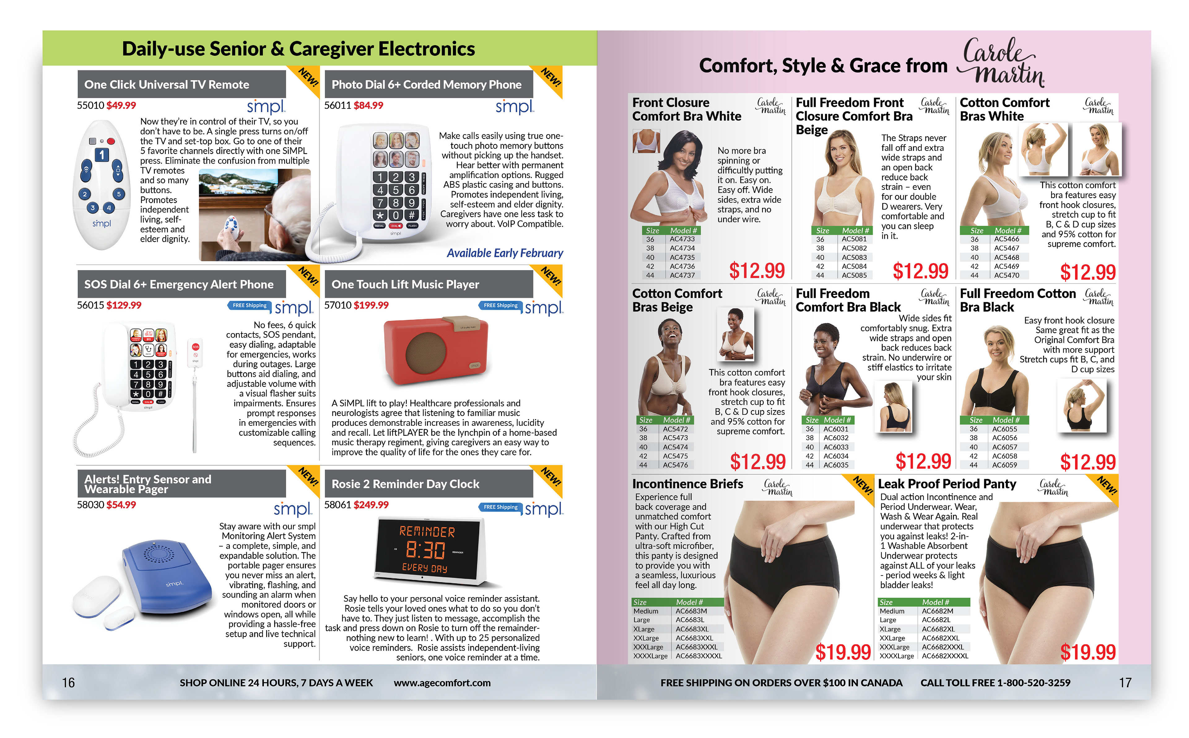
For the AgeComfort 15th anniversary edition, I introduced a secondary typographic hierarchy specifically for featured items. This system used larger headings, more prominent pricing, and italicized call-outs, all while staying within the same font family and adhering to AgeComfort’s branding guidelines. This design choice allowed the featured items to stand out while still maintaining a cohesive and professional look throughout the catalogue.
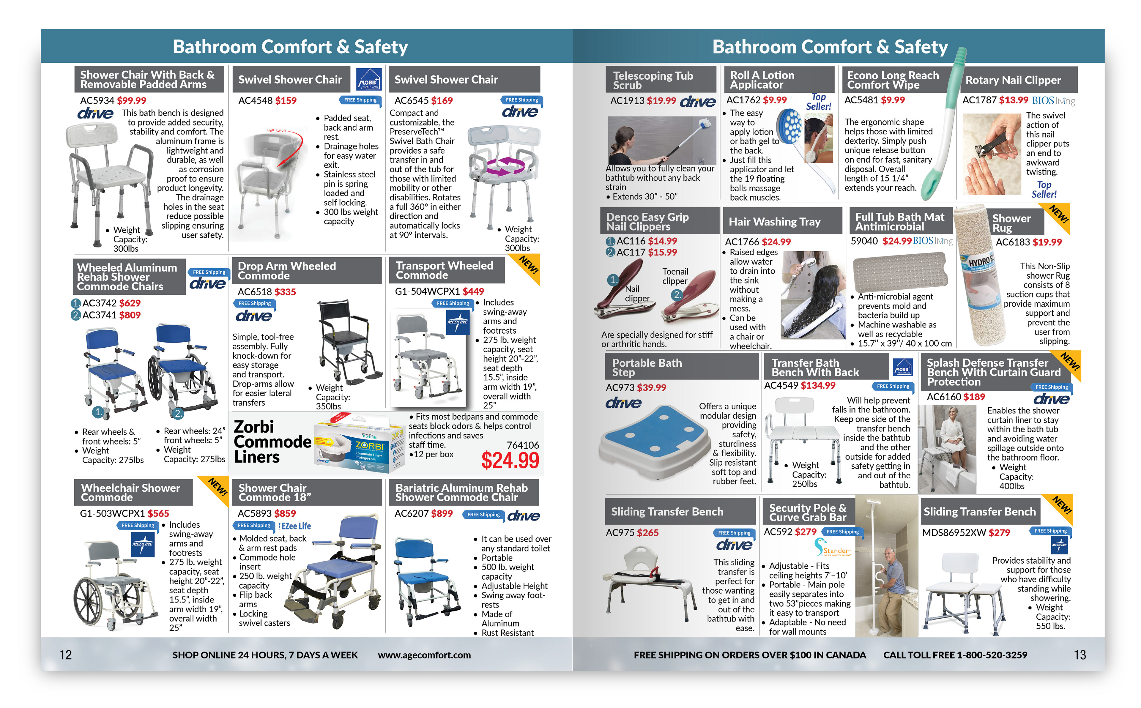
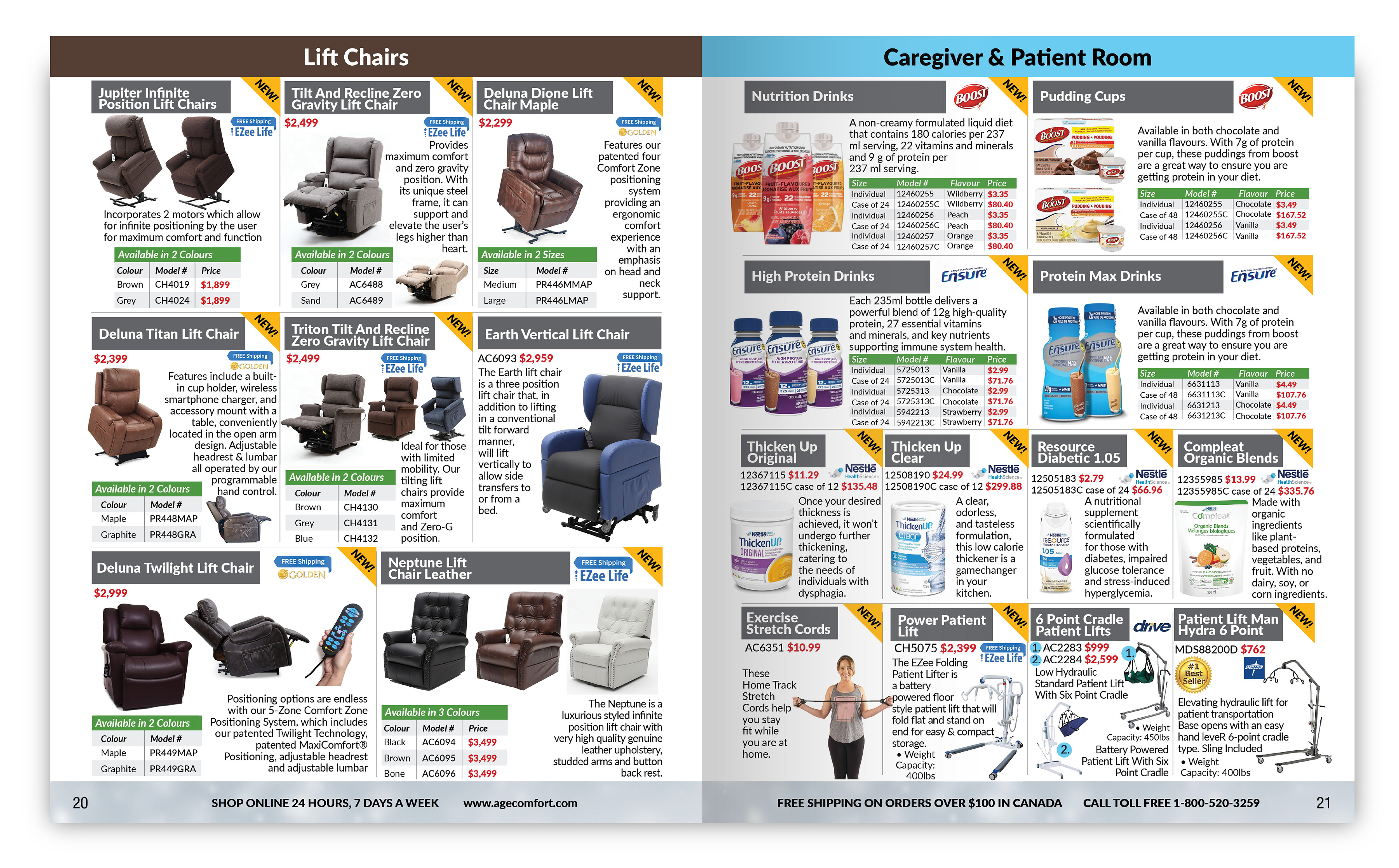
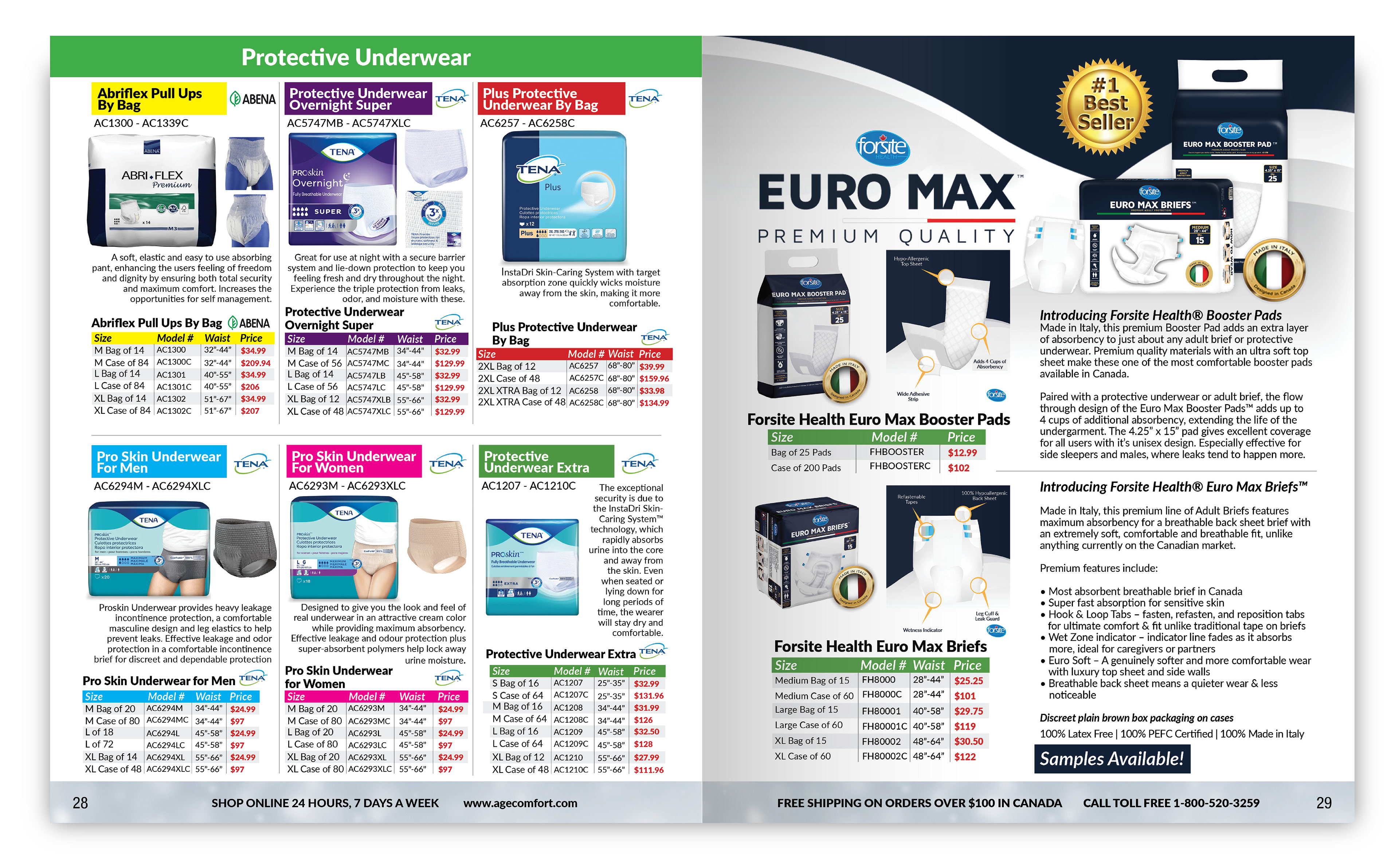
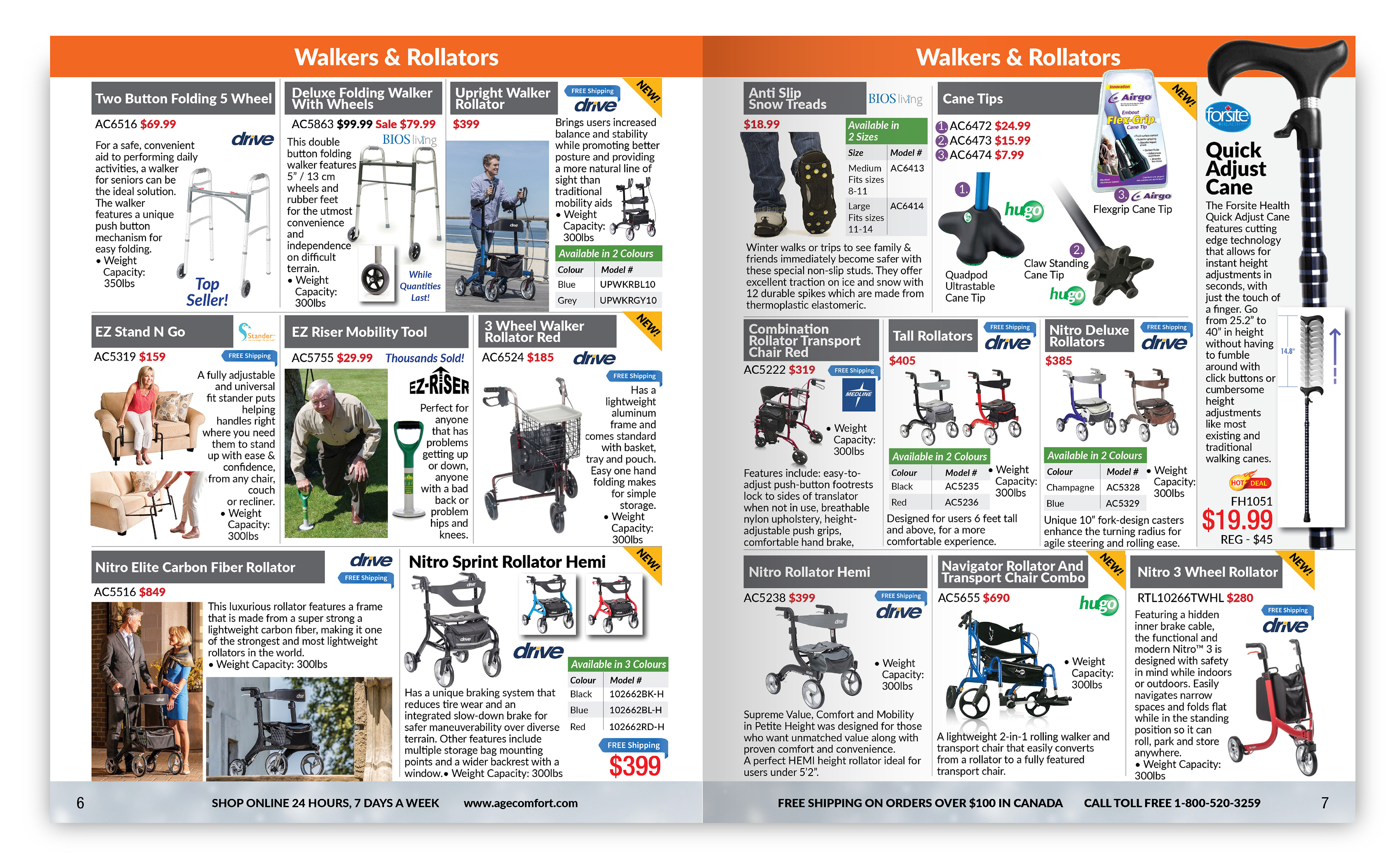
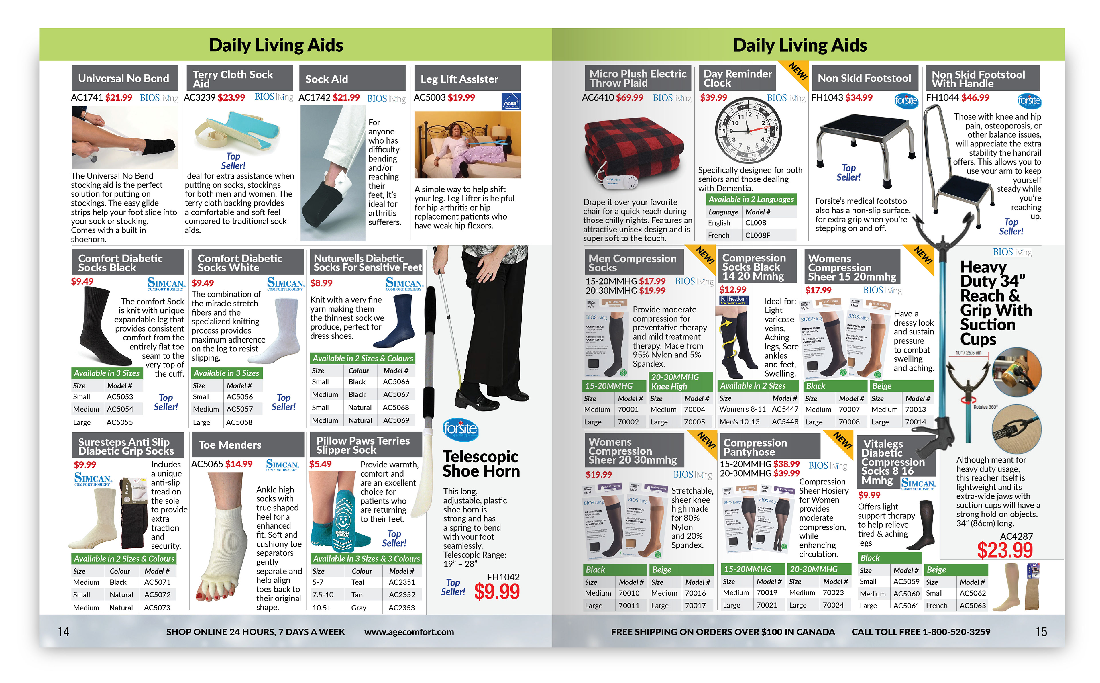
I used cropped product shots and allowed certain items to bleed over their bounding boxes, creating a more fluid and dynamic layout, moving away from the previous rigid grid system. To differentiate AgeComfort from the competition, I designed colourful, branded feature pages to highlight our vendor's products. Additionally, I incorporated custom-coloured charts for some items to showcase various options clearly.
To add visual interest and break up the content, I included lifestyle images that show the products in use. This approach was designed to help seniors better understand how to use these products, especially those they may not be familiar with, making the catalogue more accessible and engaging.
The Outcome:
The catalogue saw a notable increase in sales compared to its predecessor, as measured by trackable click-throughs on its digital version. Since AgeComfort and Busy Bee Tools are sister companies, we also made the printed version of AgeComfort's 15th Anniversary Catalogue available for pickup at Busy Bee Tools locations. These printed copies quickly became popular, often running low and needing to be replenished.
Although AgeComfort is primarily an online retailer, offering the printed catalogue helped boost sales and overcome a longstanding challenge. The President made the decision to print this edition due to the fresh look I had created, marking the first time in years that AgeComfort printed a catalogue.