Client: Busy Bee Tools | Year: 2024 | Project: Full Summer 2024 Digital Catalogue Design

The Brief:
I joined Busy Bee Tools in December 2022, and by May 2023, I was entrusted with redesigning their 60-page annual digital summer catalog. The objective was clear—modernize the layout, inject more energy into the design, and ensure it could stand competitively within the woodworking and metalworking industry. The company, with nearly 50 years of history, recognized the need for a complete refresh, moving away from outdated fonts, imagery, and branding systems. My redesign was so well received that in May 2024, they once again entrusted me with full creative control over the next 60-page summer catalog.
For the 2024 edition, I was challenged to elevate the design even further. Beyond refining the visual identity, the catalog needed to serve as a strategic sales tool during the slower summer months—driving engagement and converting views into revenue. My approach focused on stronger layouts, a more dynamic use of typography, and a seamless integration of branding elements to create a compelling and user-friendly experience. This project reinforced my ability to blend creative direction with strategic marketing, ensuring Busy Bee Tools remained visually competitive and commercially effective.
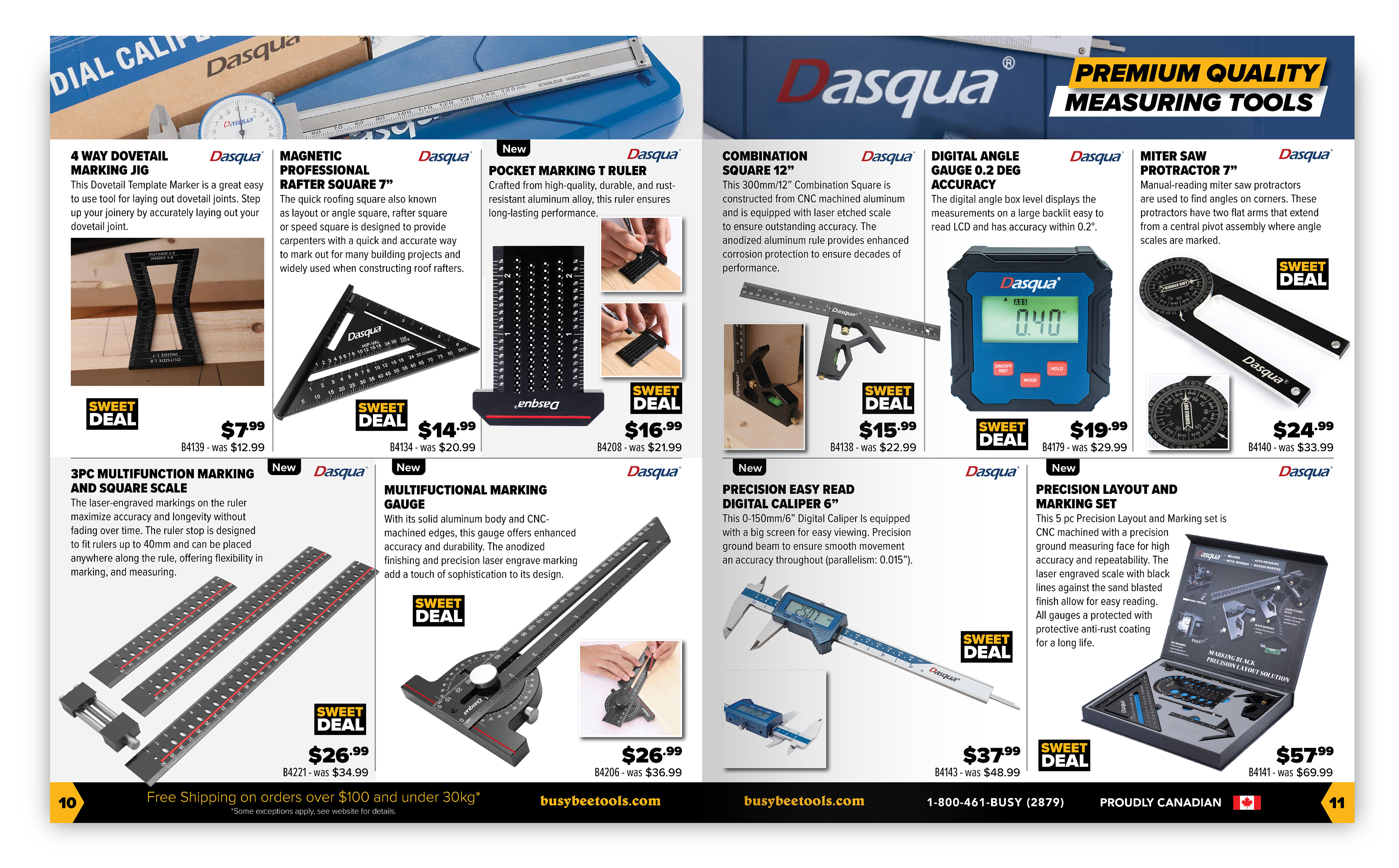
Most of the items you see in this catalogue were photographed & edited by me using our in-house studio and lighting, as well as our Canon Rebel DSLR.

The Process:
I drew inspiration from my passion for magazine design to shape the catalog’s visual direction, focusing on layouts that felt dynamic and engaging rather than rigid and formulaic. I introduced lifestyle imagery, strategically cropped product shots, and allowed select items to extend beyond their bounding boxes, creating a more fluid and immersive composition—breaking away from the static grid system previously used.


The Conclusion:
To differentiate Busy Bee Tools from its competitors, I incorporated branded top header banners featuring section headings, high-end lifestyle imagery, and original photography that I personally captured. Additionally, I integrated light gray backgrounds behind certain products to enhance legibility and improve the overall reading experience. These subtle yet intentional design choices not only created contrast between products but also guided the reader’s eye seamlessly through each page, ensuring a more intuitive and visually compelling catalog.
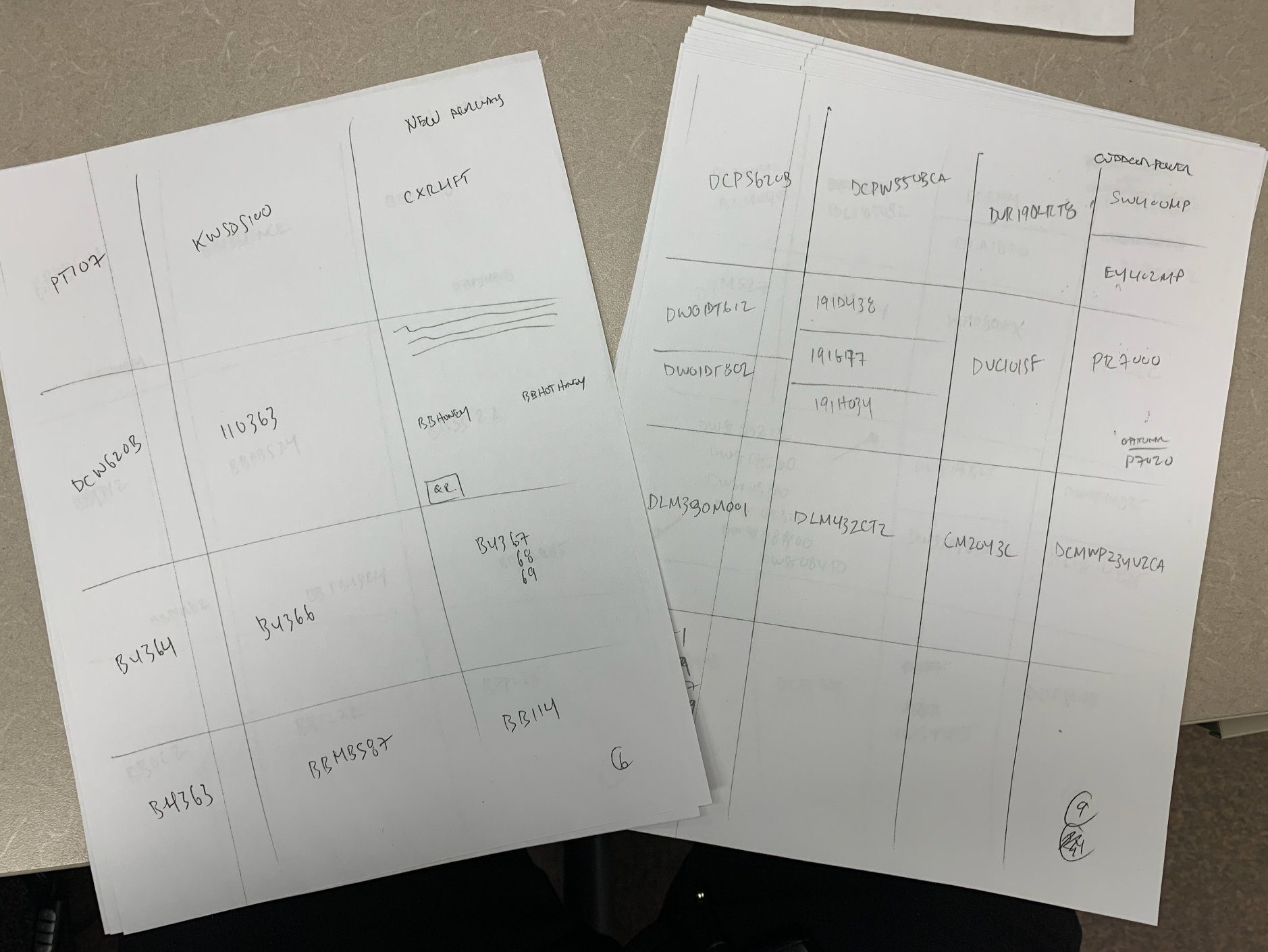
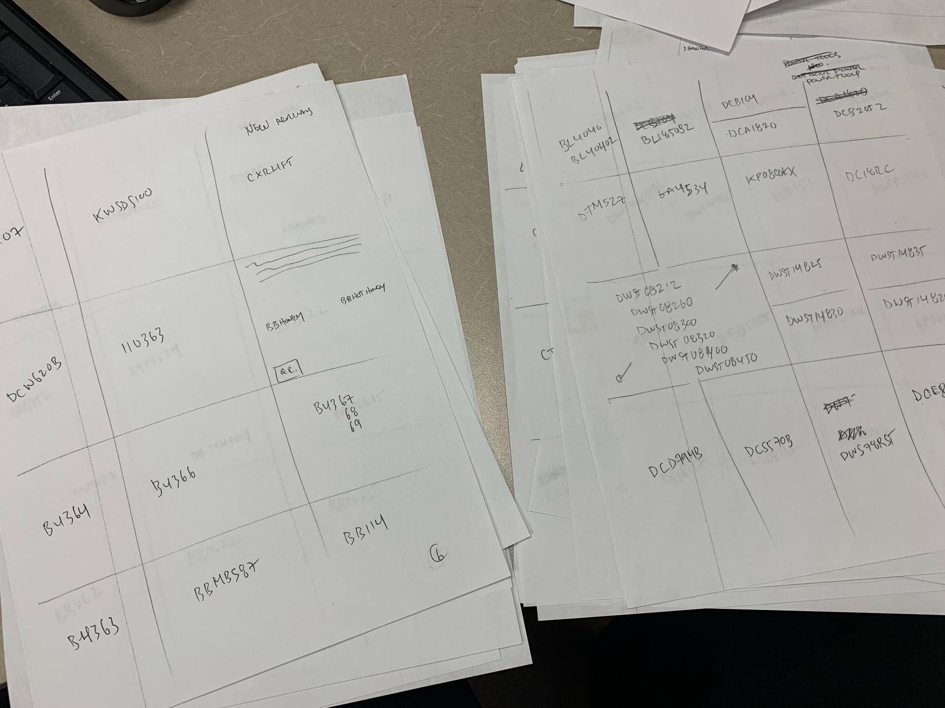
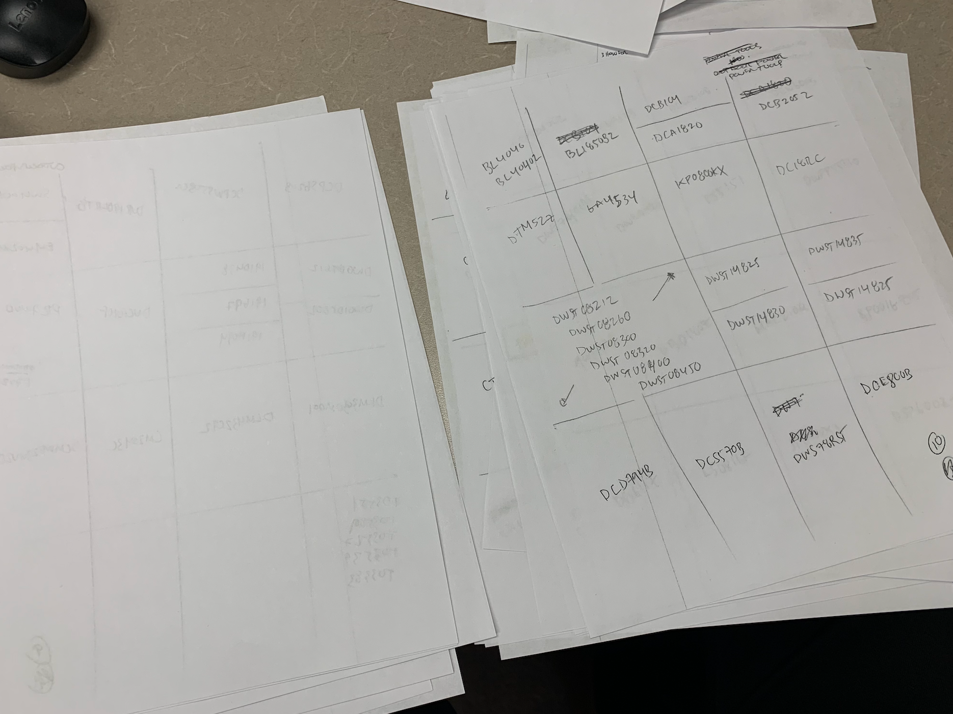
The Rough Copies:
Every catalog begins with a foundational blueprint. I receive hand-drawn rough layouts from the president, which serve as the initial framework for the publication. From there, I take a strategic design approach, transforming these sketches into a visually compelling and structured catalog that effectively showcases the featured products. Through careful typography, layout refinement, and brand alignment, I ensure that the final design is both functional and engaging, delivering a seamless browsing experience for our audience.