Client: Soccer 360 Magazine | Year: 2022 | Project: Entire Magazine Issue Design
The Problem:
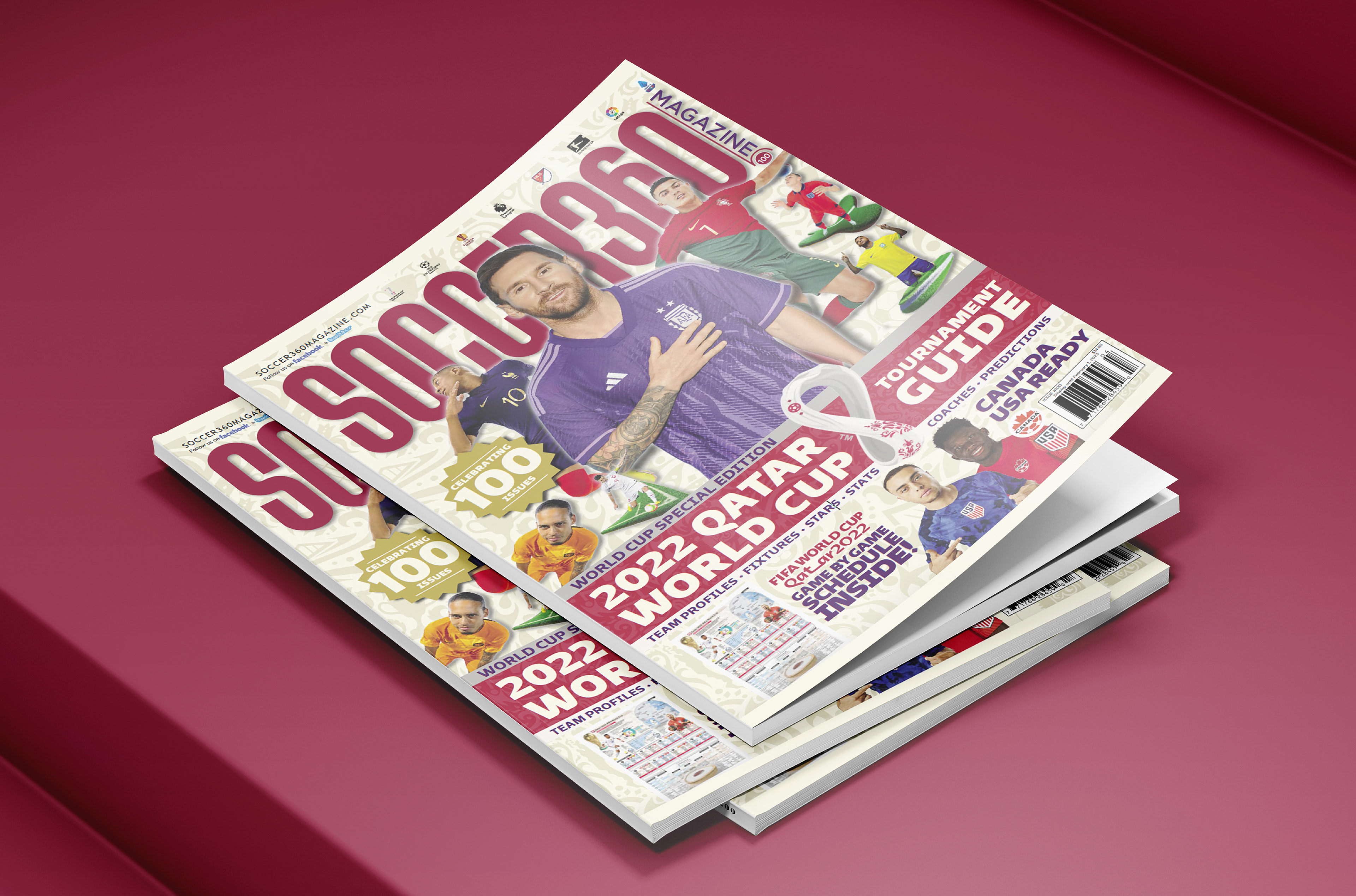
During the summer of 2022, I was away and unable to design an issue of Soccer 360 Magazine. As a result, the project was outsourced. Once the issue went to print, our European stakeholders and funding partners expressed serious concerns, even threatening to withdraw their support if the new design became the magazine’s standard. While the execution wasn’t disastrous, it lacked the bold, dynamic layouts and rich, in-depth content that define Soccer 360 Magazine. Our contributors and financial backers in England were particularly dissatisfied, calling for a complete creative and editorial turnaround for the following issue—which happened to be our high-profile World Cup 2022 Special Edition.
As the lead designer, responsible for crafting each issue from cover to cover, the responsibility of restoring the magazine’s signature aesthetic and editorial quality fell squarely on me. My role in the fall issue was not just to refine the design but to reestablish Soccer 360 Magazine’s visual identity and credibility, ensuring we delivered the level of storytelling and immersive layouts our audience and stakeholders expect.

The Process:
The first place I looked when beginning my analysis was past Season Preview issues I had designed. While I had previously created numerous World Cup and Euro guides for Soccer 360 Magazine, this edition was different. We needed to demonstrate to our investors that we could evolve our design approach to meet modern standards while delivering even more in-depth content to our readers. To refine our strategy, I also studied how FourFourTwo and World Soccer Magazinestructured their special editions, analyzing their layouts and the type of information they prioritized.

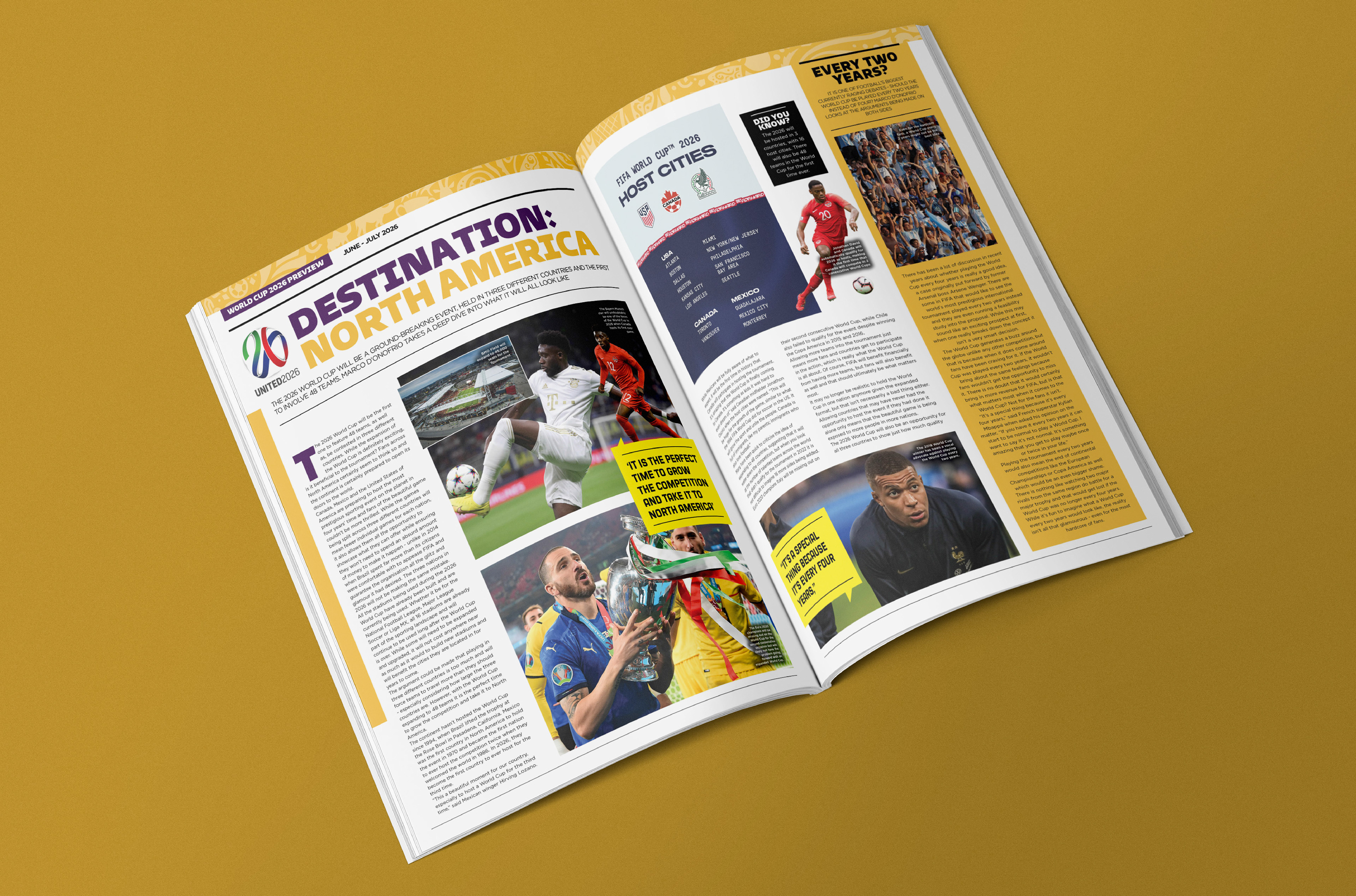
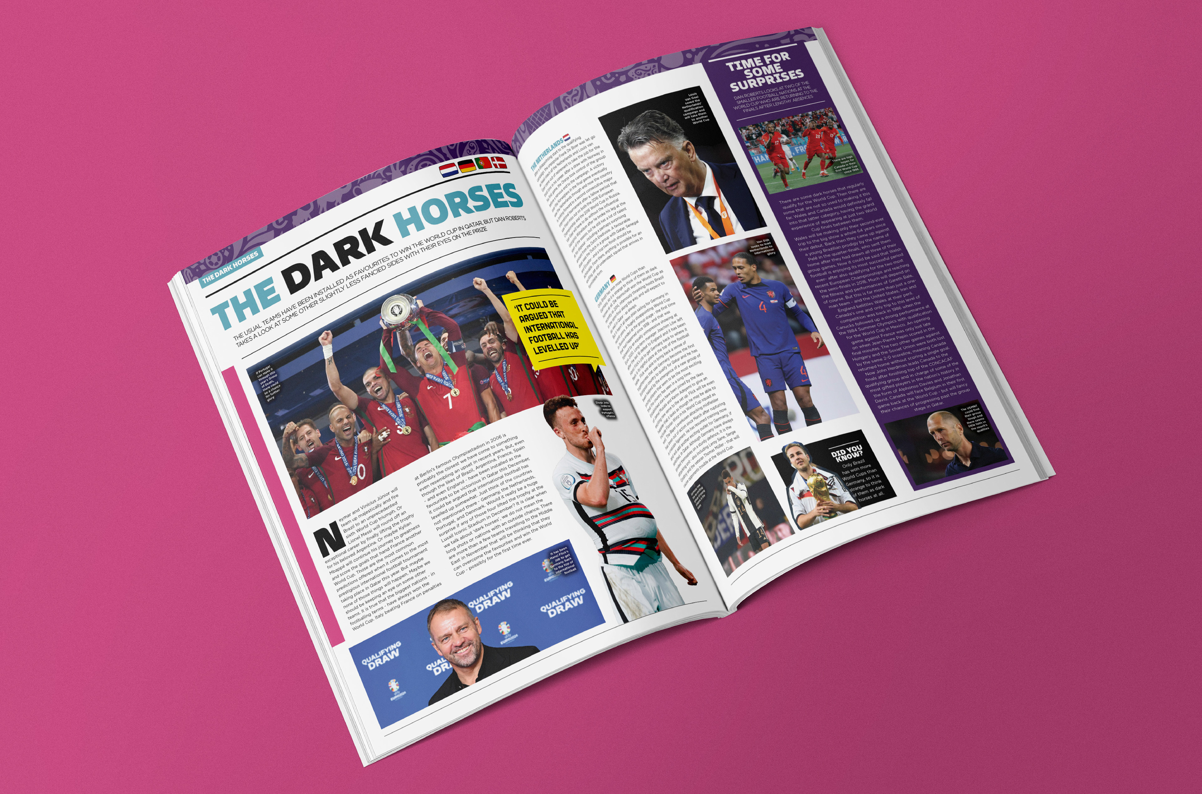
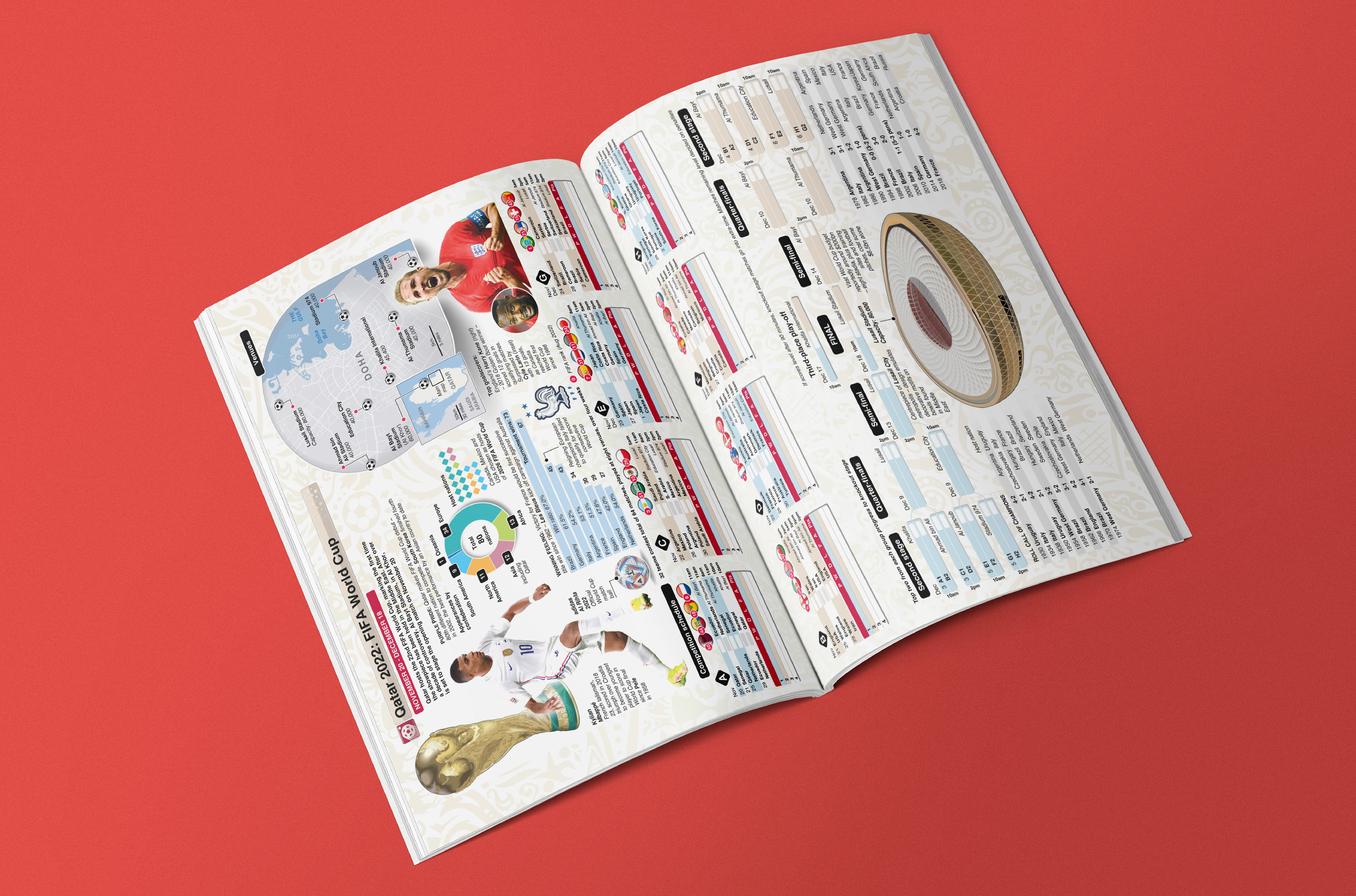
The first step in my design process was to fully immerse myself in the branding of the FIFA World Cup 2022. We acquired the official fonts, licensed the tournament’s motifs, icons, and stadium illustrations, ensuring our visual direction aligned seamlessly with FIFA’s branding. Using these assets, I reimagined our headlines and feature page templates specifically for this issue, tailoring the design to reflect the tournament’s identity while maintaining Soccer 360 Magazine’s signature style.
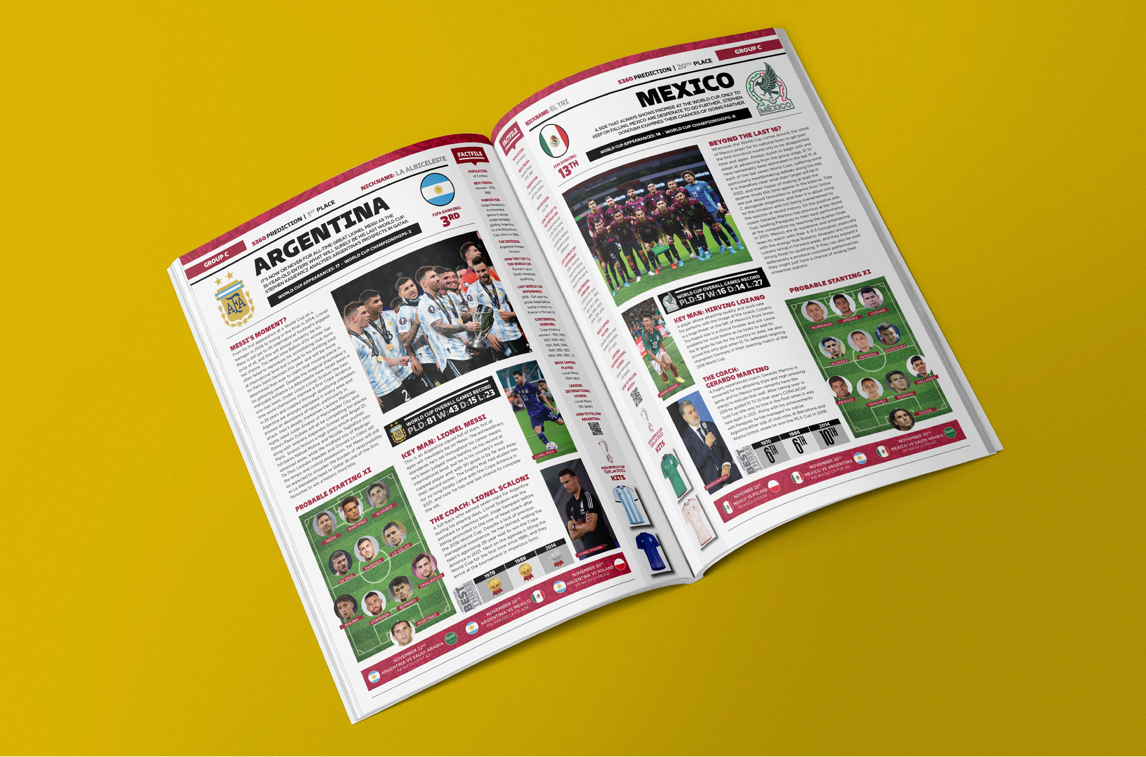
I crafted custom headings, incorporated the official World Cup fonts for team names, and structured the layouts to maximize the depth of information. Drawing insights from World Soccer Magazine and FourFourTwo, I expanded our coverage by including key team transactions, new kits, predicted starting elevens, projected finishes, and key players and coaches. To create a cohesive visual experience, I infused FIFA’s branding colors throughout tables and sidebars, reinforcing consistency and elevating the issue’s identity as a definitive tournament guide.
Beyond the team breakdowns, I extended this branding approach across the entire issue, ensuring a unified and engaging reader experience. One of the standout features I introduced was an interactive tournament poster, designed for young fans to track match results, winners, and the tournament’s progression. Once I developed the initial templates and sample pages, I shared them with the magazine’s owner and editorial team. The concept was met with enthusiasm, and I received full approval to move forward with the rest of the issue.


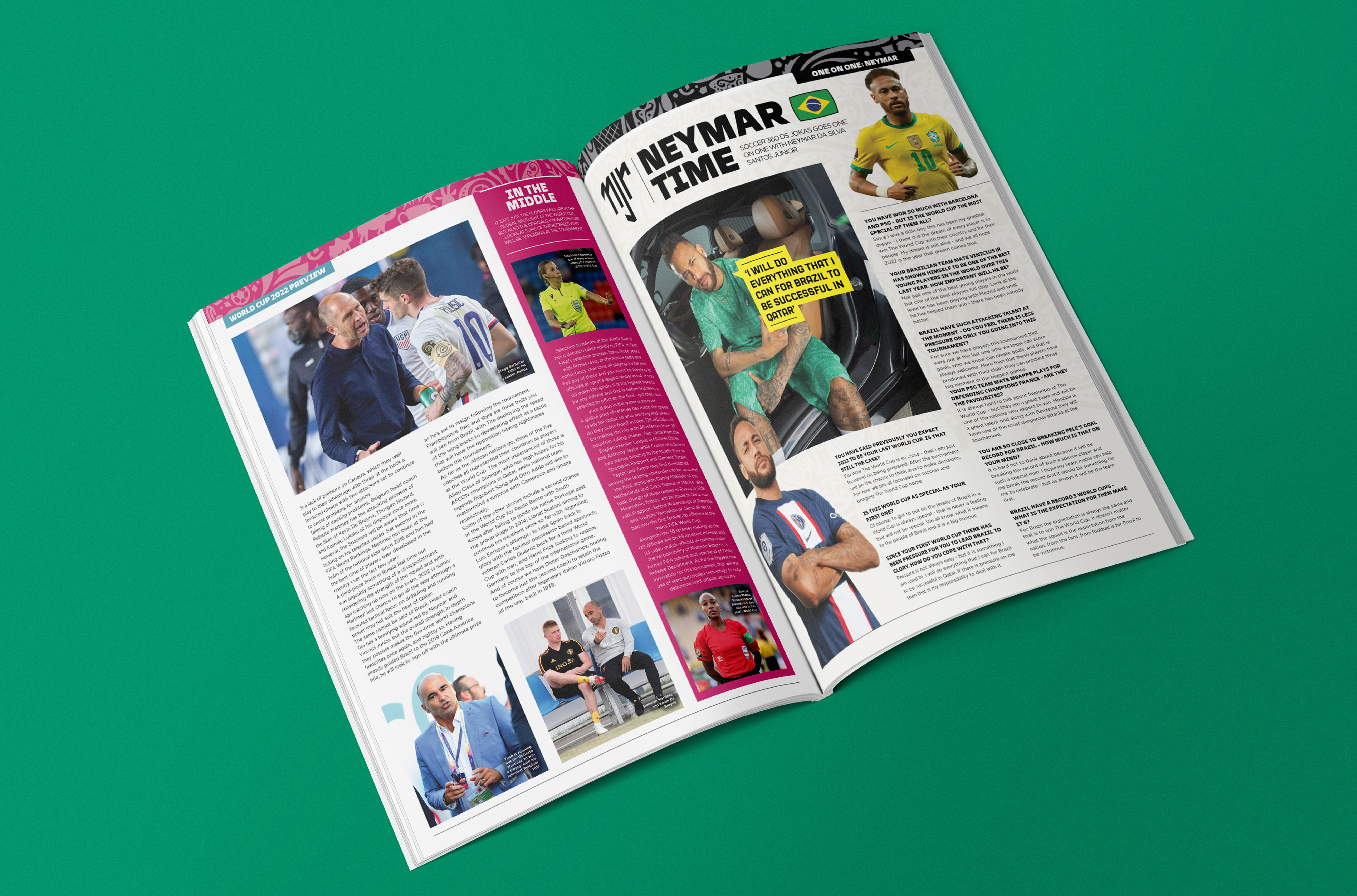
I led the creation of a FIFA World Cup 2022 guide that truly resonated with the younger generation of soccer fans—our primary target demographic. My approach focused on delivering a visually engaging, information-rich experience that readers could reference throughout the entire tournament. I directed the integration of key design elements, ensuring that every page maintained a balance between depth of content and accessibility.
A key aspect of my leadership in this project was establishing a clear and consistent visual identity. I set the direction for branding, ensuring a cohesive use of FIFA’s motifs, icons, and color schemes throughout the issue. I also restructured the typographic hierarchy for better legibility, guiding my team in refining how headlines, subheadings, and body copy interacted across spreads. Additionally, I emphasized stronger imagery selection, directing the placement and curation of high-quality photos to enhance storytelling.
The transformation from the previous issue was significant. This edition featured a streamlined, modernized layout, improved use of space, and a more dynamic blend of text and visuals. By maximizing the density of information without overwhelming the reader, I successfully elevated the guide’s functionality and appeal, reinforcing Soccer 360 Magazine’sreputation for delivering premium editorial content.

The Conclusion:
Our investors and writers were once again satisfied with the magazine’s design and depth of information, relieved that we had not continued with the previous issue’s branding and layout. With only one issue to execute a complete turnaround, I successfully reestablished the magazine’s visual and editorial standards, restoring confidence among our stakeholders.
Looking beyond this single edition, I took a proactive approach to ensure the magazine maintained a high level of quality moving forward. I refined the layout, optimized the color schemes, and enhanced both the quantity and quality of information presented. Additionally, I developed a set of intuitive, easy-to-use templates, allowing for seamless execution in future issues—particularly in the event that I was unavailable for a production cycle. This strategic framework not only safeguarded the magazine’s identity but also reinforced its adaptability for future editions.